Showing posts with label Specialism. Show all posts

Specialism: Prop Design Week 1 and 2

For this art test, I chose 2 of 4 briefs, both under prop design. One featured a Victorian aesthetic, the other a more futuristic one. Personally, I detest guns and find them dull, so I decided to design the most fabulous gun I could. I'm also not a fan of sci-fi, so decided to tackle that in creation of a crate.

Starting with the Victorian object, I roughed some silhouettes on items I thought were interesting of the time, in shape and form.

Having decided to go with the gun idea, I used silhouettes and a digital collage technique new to me, which was helpful in its own ways.


Roughing some ideas further in my sketchbook, I was very drawn to the idea of an eel gun. It was madcap and had historical relevence, there being an influx of eels during the Victorian times. What do you do with so many eels? You weaponise them. Liking the fact electricity had to be cranked to use a Victorian phone, I added that to the gun, wanting it to have be a four-barreled blunderbus after looking into guns and how they worked and what might work the best, the wide nozzle of this particular gun making the most sense. 


Having roughed more ideas, considering other things like Queen Victoria's jubilee ( a royal gun seeming reason for elaborate design), I decided to go forward and model and paint over my strongest idea.


With an eel tank on the top and a crank on the side, I felt this worked. But then, how would it be carried? How would it be used? Surely its too heavy, too large? So I worked on some further concepts.


Then, size in mind, I looked into flamethrowers of WW1 and a tank strapped to the back of the user made more sense, though the idea of a horse -drawn-eel-spewing-turret-carriage was compelling.

Using Maya further, I developed the small zapgun like gun through iteration, closely studying a book on Victorian Stencils, developing them into forms of the gun, elaborate patterns becoming scopes and adornments.


The idea of the back pack was to have it as a refurbished coffin, being quite common in this era in not having enough graves for bodies. The size would have to be that of a child, made of metal, which was seemingly common in the bourgeois.


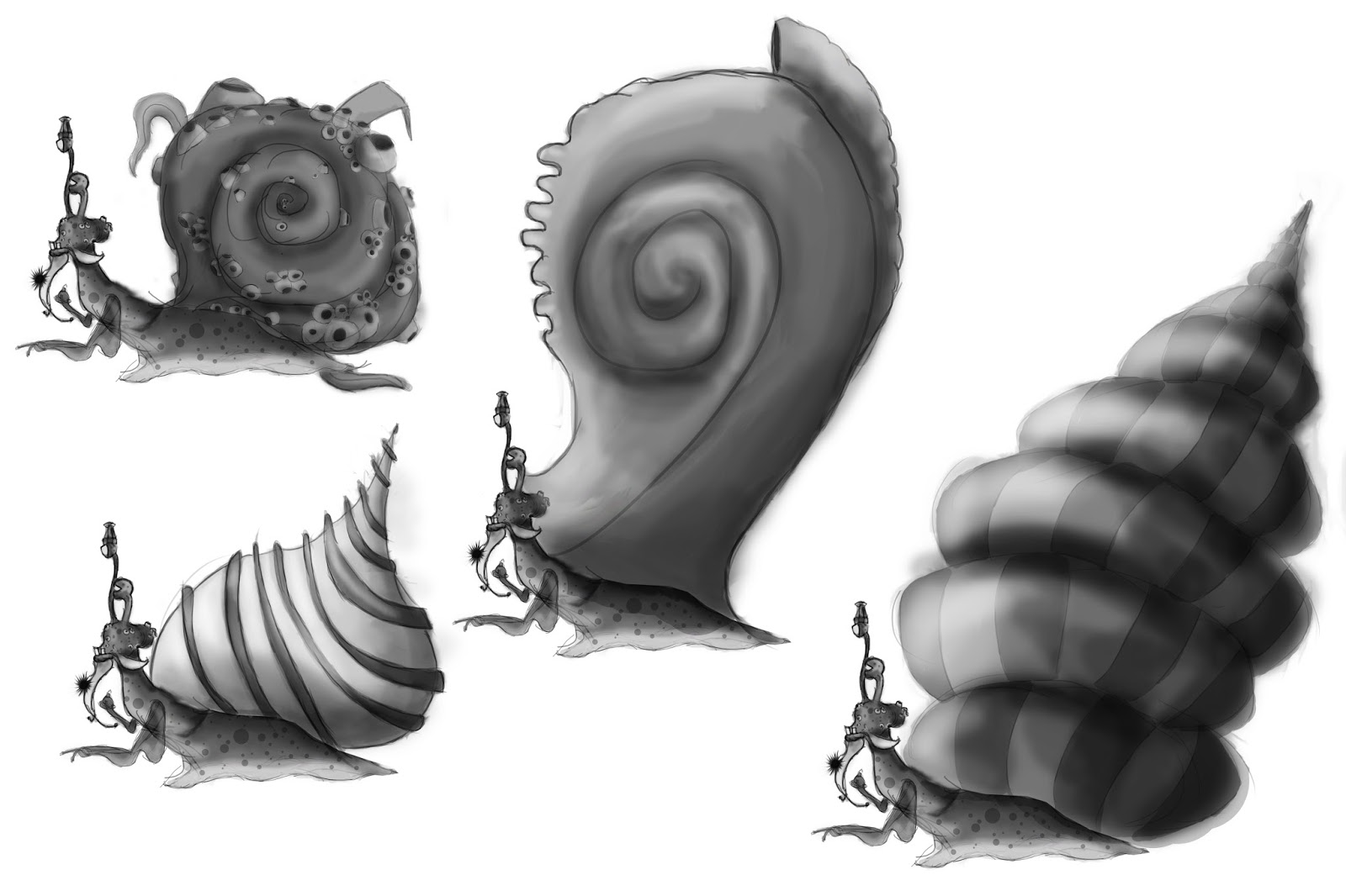
So here we have my eel gun. The main idea with this brief was that there was an organic element of the item that was rotting and causing it to malfunction. Ignoring science, the gun would be used with live eels as a sort of Victorian taser, a crank electrifying the eels. But in Frankenstein fashion, electrifying dead eels brings them back to life, free to spread a vast zombie-eel plague. In hindsight, a plague mask should really have accompanied this item.

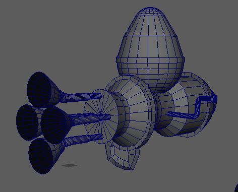
The next item being sci-fi, it has to be a crate holding a deadly substance that's been badly damaged, the substance now leaking.


From silhouettes, to sketches, to iteration. I was very taken with the more Utopian route of robotics seen in curves, beveled edges and a prominence of white. Portal, I-Robot and Wall-E's Eve being points of reference.


A sci-fi crate that prisons a liquid monstrosity, bullet holes allowing tentacles to slip out, explosives opening whole segments and a crudely hacked and broken control panel.

Despite not really ever tackling props, I've really enjoyed this. Though some texture studies would help me out a lot!


Art Test- 2D Character Concept Art- Monkey Island TellTale Games- Week 2

Second week of Art Tests, I worked with my final design, first creating a model sheet for the human form...

I tried to take on a 3D modeler's perspective, as my character's in a loose patchwork coat, the body underneath would often be seen, so I presented that and a size comparison. I considered having the bag on a seperate sheet, but though it would be easier to have it all on a large image.

For the character sheet

I tried thinking more from a riggers point of view, butting bones in the beard for animation's sake. Some very loose sketches explaining posture and overall feel.

The twilight form, where my shopkeeper takes on the form of a seasnail...

The chest on the back I thought could use some different perspectives.


The character sheet here serves to illustrate the jokes to be had at its expense, expressions and player interaction.

The character piece, with of course some reference from yours truly, mainly for gesture and expression.


A line and block-in, I wanted to include the snail form and have some duality in the composition, but the forms being so different in shape, I couldn't find a way of having the two with it looking balanced, explored in very tough pencil thumbnails.


To the value and colour passes. I received some critique about focal point and value, the lighting needing to direct the eye, the gems needing to be pulled out a little more, so going back to the value layer and adding some highlights and experimenting mildly with a texture brush...


I was concerened this would obscure the character, but it adds far more mood. Im full aware environments should be something I practice in future, some texture studies wouldn't go amiss either. On to the next Art Tests!

Art Test- 2D Character Concept Art- Monkey Island TellTale Games- Week 1

Project Monkey Island: Lost Cove 

Project Description Telltale is creating a new installment in the Monkey Island franchise. Following on from its successes with Game of Thrones and The Walking Dead. Lost Cove features a mechanic where the player can switch between normal day time and a mystical and spooky twilight dimension. 

Task Requirements: Design a shopkeeper character that resides in a remote underwater sunken temple. You don’t know how they get custom but they are surprisingly happy with their situation. 

Design and present both their normal and twilight state. 

Task Specification ❖ Model Sheet ❖ Character Sheet ❖ Concept Painting


Having chosen this art test to get into some character design, I started out by scribbling some loose doodles to vent some preliminary ideas, research the visual style and understand the world of the game- will what I design fit into this universe?

I looked into existing designs and TellTale concept art, studying what kinds of characters already exist as a point of reference.


I was really quite taken with LeChuck the zombie pirate, who has many different forms throughout the series; its interesting to look at how that may influence my character's two forms. The ferrymen, a more supernatural character, I felt had a compelling design, an emphasis on curves seems paramount throughout the art direction of this game.

I wanted my shopkeeper to have an interesting quirk, like finding and keeping notes in bottles, displaying them. Among my first ideas, I liked the idea of a sea hag who was a beautiful mermaid by day, but monstrous in the twilight- or a thespian ghost who by day would pretend (poorly) to be a human by wearing a mask and a cape. There's a lot of comedy in the characters and world of Monkey Island, so I wanted my character to have a joke or gag tied to it, something Guybrush Threepwood could play with in an interesting way.

I got on a created some silhouettes.


Having only just learned the joys of the softbrush, this silhouette out of those I'd chosen and scribbled over stood out the most. I was really fond of the squat body and angular, thin arms, the backback roll also gave me an idea...


Scribbling these two forms out, I liked the idea of my salesman being some form of seasnail by twilight, his huge bagpack filled with wares becoming a snailshell. The idea of Guybrush making puns about my "Snailsman" who could've once been a "snailor" amused me too much not to push the idea forward.

From here I started iteration, focusing on head design to lead the rest of the character.


I was really fond of the original face, but decided upon the bearded head as I thought it was the most expressive, appearing as a more well-kept person- I also like the idea of attaching a snail shell to his beard.


Having a clearer idea of the head, I had little idea about the rest of the body, so did some quick sketches playing with shape and posture. A more sort of "Gollum" like crouched posture appealed, yet a more sophisticated, taller, thinner character also seemed like it could work, a little like the Happy Mask Salesman from Majora's Mask.


I eventually made the head more disheveled, extending the beard and adding nautical paraphenalia, however a compass monocle was an idea I quite enjoyed. I then played with body shapes, posture, costumes and colour.


Putting different objects on the backpack could really add some dynamics to the overall silhouette- I was most fond of No. 3 as of the sleeves and position, I feel he's be really tall but permanently crouching under the weight of his wares. I was fond of the sombrero, but preferred the hat from No. 2 due to the interesting shape.


   I like the idea of the coat being patchwork, handstitched from loose scraps taken from what washed into the cove, anything he finds being anything he sells. The hat he wears would have a coin attached, the first he found and what he took as a sign to become a salesman. I wasn't originally too keen on more rustic colours, so tried a more clownish palette.

However, I went back to my original colours, I just removed the blue and opted for purple instead.

I then started work designing the Twilight form, that of a snail. I imagined this "spooky twilight realm" to be like that in A Link to the Past, where people animals reflective of who they are, a sea snail in this guy's case.


Sketching out head designs for this form, I opted with the highest one, though a barnacle beard could've been a quirky feature.

I wasn't sure about placeent of the hat and originally wanted it held aloft by his right eye, but now think it better on his left to make the overall shape more harmonious.


I then started playing with shell designs, but felt the first, more traditional shell would fit the world of Monkey Island better and keep with the similarities of the human rucksack.

The interest would therefore be in the details, adding crystals to the barnacles and then a whole treasure chest, flag and seaweed. This I feel more comic and fitting.


I wanted colder colours for the twilight form, to contrast the human one and fit better with the them. I went with the bottom right as I felt it worked the best. Im quite keen on the idea of my snailsman sellking things that latch onto his shell, heeping his earnings in his chest. All things to be explored in the character sheet!

The human's bag I went back and redesigned, scribbling some loose shapes to the detail.


I now have enough to work on model sheets, character sheets and a final illustration, shall get on!