Collaboration Project Week with Graphic Design

15:07 , 0 Comments

This week, I've collaborated with Graphic Design, Graphics for Publishing and fellow Games Art students. We were given two words, and left to our own devices. Our words were "Surprise" and "Pencil".

Immediately after being grouped, we sat together to discuss our specialisms, skill-sets and how we could apply them to this project- we began by writing all our first ideas down in brainstorms.


We had some... interesting ideas to begin with, but through constant talking our ideas started to take shape. We talked about the idea of surprise, perhaps leaving pencils in locations with words laser-printed into them, the idea of street artists leaving free art for people, a pleasant surprise- the joy of discovery. We soon had the idea of leaving pads as well, perhaps enticing the public to draw, perhaps at train stations or whilst waiting for the bus, where people gather and have little to do. This could be part of a capaign, perhaps promoting an even like The Big Draw or perhaps a charity. Leaving part of a drawing for people to add to if desired was also an idea.


We soon developed this concept further with a focus on promoting charities. We had the idea of an app, still using this drawing idea with pads at places as way of promoting it. We'd have users draw things in the app, people in that location, say London, would be assigned the task of drawing an animal, any animal- these drawings would come together to form a large mural of the WWF charity logo, a panda. There would be a range of small challenges people could take on, donating via the app to these charities would unlock new pallets and tools to use- the app being a means of promotion for these charaties. These murals would be made into larger physical posters to promote further, merch such as mugs and shirts, and of course pencils, would also be sold for the causes with these designs. We seemed to have come up with a business at this point, but soon realised we'd completed run away from one crucial element, "Surprise". Having really developed and got carried away with this idea, we started again, but still focused on the idea of an app. 

We started again. From our original idea we branched out and had the idea, with much discussion, to create a sort of social media for artist, that was less about chatting via messenger, and more about gathering in real life to potentially collaborate. We discussed much on the potential ins and outd of this app, but it would primarily focus on location of the user and nearby art classes, events or gatherings with users able to set up own events in public, cafe drawing for example, a way for like-minded or different people to meet. There would be a surprise spotlight everyday on new, recommended or popular events and there's be qr codes in certain popular drawing hotspots such as monuments or museums that would let nearby users come together.

With our app idea in place, everyone in the group had made attempts at logo creation and app icons. Myself included.


None of these were used as I was essentially playing the Graphic Designers at their own game, but it got the ball rolling for the others to build from. This was also good practice for using techniques and an approach I hadn't before to photoshop.

A colour pallete had been chosen and the Graphic designers set out on webpages, icons and layouts, others worked on menu flow and various roles were given out. Our project was far more geared towards our graphic designers, but we still found a use for us Game Artists in useful ways, one team member highly interested in Game Design covered UX and elements of UI that were broadened by the teams Graphic Designers, the other worked on an animatic for the loading screen. I discussed the use of a mascot rendered in 3D software, a chameleon or a peacock.


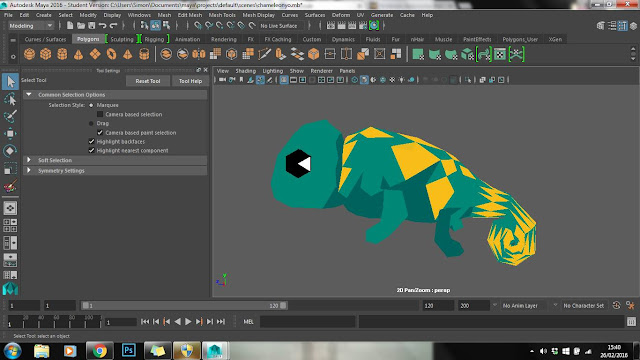
We quickly decided to drop the peacock idea and instead opt for a little chameleon that I was put in charge of modeling, to be used in promotional materials.

For this model we wanted a lowpoly aesthetic, and I was about to use new techniques in way of a new shader and texturing technique that didn't feature UV unwrapping, but painting right onto the faces themselves. After a failed attempt from trying to model from a complicated polysphere, I started again with a more simple primitive.


The paint vertex tool proved difficult at first but I soon adjusted. With guidence and crit from my team, I slowly painted the model in more aesthetically pleasing ways, using different brushes and experimenting with eye size and horns.


The chameleon would sit on a pencil and the horns were removed. Getting renders of the pencils themselves were a collaborative effort as my laptop cannot render anti-alliasing as it hasn't the power to use viewport 2.0, a team mate taking the file I sent them to get pencil render to also be used in promotional material.


And the chameleon


Alongside its use in a potential external website.


Throughout this project, I found myself taking very much a leadership role, something I'm not used to doing, I honed in on what people's interests and skills were and leveraged this so our group worked harmonious, we all had a voice and a lot of input in this project, I just found myself able to direct the group and stay on path as well as listening to everyone I was working with.


0 comments:

Personal Study- Louise Bourgeois

12:59 0 Comments

So I've been working on this study on and off for a very long time now, and have learned a great deal from doing it. Whilst the proportions aren't perfect, I'm still proud of what I achieved, and with so much work put in I owe myself to take progress shots to make into gifs!

Next time!

Also see a much earlier progress shot with a smattering of colour...


0 comments:

BA2a- Evaluation

21:21 0 Comments

This project without a doubt has been the hardest out of all others so far, for a variety of reasons, one obviously being the fact it’s been the longest. I tried hard early on to gain as much as I could about UE4, spending too much time experimenting with 3D despite knowing I was going for 2D. I really struggled to understand blueprints and if there was a node that existed for what I wanted, but having spent the time I have, I can now fairly autonomously blueprint a range of basic mechanics, having a toolbox of sorts. I left my Pitch Document right up until the end when both should have been done together, all my time spent away from home where I could access UE4- when I could have been working on my Pitch Doc.

I did organise my time a lot better with the help of Trello and despite my struggles with blueprinting, sought out ways of using what I learned from tutorials, like all the mechanics behind UE4s 2D platformer default., building my own from scratch. I then applied this knowledge with newfound information on animation, learning in my own time to create a walking sprite and have it turn like the default sprite does.

I chose to create a game that was deeply personal, which straight-off I had reservations about, not wanting to go to deep. However I decided to go along with it, as it was more unique and appealed to me more than my other, more ludic ideas. This was a mistake. Whilst I’ve created a prototype I’m incredibly proud of, almost every interaction and mechanic being a metaphor, players entertained by my game for large lengths of time as of the flow I’ve created, the price has been absolutely massive. Perhaps too personal for an evaluation, but I as a human being create this work, I’m the key component to it. My mental health has been the worst its ever been, accentuated by the dilemma of so much new information to learn and deadlines, every day I was focusing on my problems that fed into the game. Every day I really focused on large maladies, living and breathing my problems, I was mentally far too focused on the negative. This led to me being very ill and having to miss out on the games jam week, but I'm grateful I did as I needed that brief week of respite to be able to continue into specialism.


I Intend to catch-up and gain some games jam experience very soon. I’m very proud of my specialism work, whilst aware I need to practice environments and materials, they were the most fun I’ve had studying thus far. I was told to perhaps create an animatic for my eel gun, simple 2D animation communicating design. Having an interest and brief experience with animation on my game, 2D as well as 3D animation are things I’ll explore during personal study. 

0 comments:

Specialism: Prop Design Week 1 and 2

20:47 , 0 Comments

For this art test, I chose 2 of 4 briefs, both under prop design. One featured a Victorian aesthetic, the other a more futuristic one. Personally, I detest guns and find them dull, so I decided to design the most fabulous gun I could. I'm also not a fan of sci-fi, so decided to tackle that in creation of a crate.

Starting with the Victorian object, I roughed some silhouettes on items I thought were interesting of the time, in shape and form.

Having decided to go with the gun idea, I used silhouettes and a digital collage technique new to me, which was helpful in its own ways.


Roughing some ideas further in my sketchbook, I was very drawn to the idea of an eel gun. It was madcap and had historical relevence, there being an influx of eels during the Victorian times. What do you do with so many eels? You weaponise them. Liking the fact electricity had to be cranked to use a Victorian phone, I added that to the gun, wanting it to have be a four-barreled blunderbus after looking into guns and how they worked and what might work the best, the wide nozzle of this particular gun making the most sense. 


Having roughed more ideas, considering other things like Queen Victoria's jubilee ( a royal gun seeming reason for elaborate design), I decided to go forward and model and paint over my strongest idea.


With an eel tank on the top and a crank on the side, I felt this worked. But then, how would it be carried? How would it be used? Surely its too heavy, too large? So I worked on some further concepts.


Then, size in mind, I looked into flamethrowers of WW1 and a tank strapped to the back of the user made more sense, though the idea of a horse -drawn-eel-spewing-turret-carriage was compelling.

Using Maya further, I developed the small zapgun like gun through iteration, closely studying a book on Victorian Stencils, developing them into forms of the gun, elaborate patterns becoming scopes and adornments.


The idea of the back pack was to have it as a refurbished coffin, being quite common in this era in not having enough graves for bodies. The size would have to be that of a child, made of metal, which was seemingly common in the bourgeois.


So here we have my eel gun. The main idea with this brief was that there was an organic element of the item that was rotting and causing it to malfunction. Ignoring science, the gun would be used with live eels as a sort of Victorian taser, a crank electrifying the eels. But in Frankenstein fashion, electrifying dead eels brings them back to life, free to spread a vast zombie-eel plague. In hindsight, a plague mask should really have accompanied this item.

The next item being sci-fi, it has to be a crate holding a deadly substance that's been badly damaged, the substance now leaking.


From silhouettes, to sketches, to iteration. I was very taken with the more Utopian route of robotics seen in curves, beveled edges and a prominence of white. Portal, I-Robot and Wall-E's Eve being points of reference.


A sci-fi crate that prisons a liquid monstrosity, bullet holes allowing tentacles to slip out, explosives opening whole segments and a crudely hacked and broken control panel.

Despite not really ever tackling props, I've really enjoyed this. Though some texture studies would help me out a lot!


0 comments:

Research- Focus on Mazes, Morality and Meta- Proposal

07:30 , 0 Comments

Having originally wanted to base my essay on the idea of meta-games, linking that to mazes and labyrinths, exploration and interaction of the game making use of paths outside itself, I have refocused this idea, by applying it to the games Undertale and Virtues Last Reward.

With a focus on morality and choices, the idea of the labyrinth and the meta qualities of both games interwoven with these themes. Citing the likes of Epsen Aarseth to explore these games as ergodic literature, I'll also be exploring Bertolt Brecht's idea of alienating an audience and Antonin Artaud's concept of the Theatre of Cruelty, doing the polar opposite. With a wide scope on morality and ethics, I'll also be exploring the John Nash's Prisoner's Dilemma, an integral theme and mechanic to Virtues Last Reward and exemplified at key moments within Undertale, as well as Adam Smith's concept of "The Invisible Hand" and the selfishness of Man- both games looking quite deeply at the morality of mankind and critiquing it. The emotional dilemmas this offers up to the player shall also be explored through narrative and player interaction with what Aarseth calls a "cybertext", and how this links to the integral part of Mazes- to gain strength and betterment- exemplified further by the Christian context of Labyrinths.

Within the context of Meta and Labyrinths and Morality, John Clowder's Middens fits all of these: a large visually obscure maze-like world to explore, where every character can be killed indefinetly and that in its finale, preaches that all living things are bored and want to die. Summarised with this line, directed completely beyond the 4th wall, directly at the player.


 All my notes for this Essay:


0 comments: