Specialism- Anatomy Project

09:16 , 0 Comments

After our Interactivity project and a week long game jam (that I missed due to some really horrible medical reasons, will deffo be catching up on that!) we were then set self directed projects, to practice the area in which we want to specialise in. I've chosen 2D concept art and focused on anatomy, using this project to practice rendering value and colour, as well as learning joins, bones and muscle groups.

I also did brief research into jobs, finding a junior concept artist role at EA, a concept art job at sega and internships at Jagex, King and Ronimo.  Jagex were looking for people who are...

  • Talented - and have a strong eye for form, shape and colour
  • Proficient in Photoshop
  • Able to work collaboratively within a multi-disciplinary art team to help bring environments to life
  • Self-motivated, smart and a fast learner
  • Interested in games
Whereas the junior role at EA...

A Junior Concept Artist's portfolio should demonstrate the following: 
• Strong traditional art skills 
• A strong ability to draw in perspective 
• A strong ability to think in three dimensions 
• Great use of light and shadow 
• A good grasp of concept development and design 

All demand brilliant technical skill and a mastery of the fundamentals, an eye for detail, knowledge of anatomy, architecture and lighting etc.

However, whilst looking through the plethora of roles in these big companies, it was whilst looking at the smaller companies like Compulsion Games makers of Contrast, Owlchemy Labs who're working on a great VR title entitled Job Simulator whose ethos is in the creation of "absurd and highly polished games" that I felt a much stronger connection to. Personally, I'd adore to work in a smaller, tightly knit group where my role would cover more than just one specific thing: being a general artist of 2D and 3D appeals to me, of course I couldn't find such roles advertised, but it's something I felt strongly as researching. Indie is where I feel I'd love to go! So I must definetly partake in Game Jams with friends and other groups, acquire much more experience!

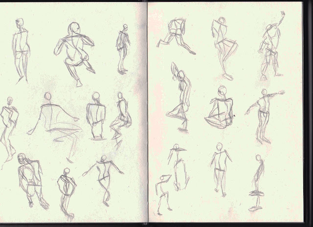
So, I started to familiarise myself with human anatomy, starting with sketches looking into bones and muscle groups.


I also started practicing gestural drawing, something I'd like to make a regular habit, like a morning warmup! 


I then moved onto value studies...


I also tried a colour study, my first time trying to render human skin! I've recieved critique suggesting use of slight colour burn for shadows as the colours are off, but I'll practice and refine further!


And another colour study where I started with value and used an overlay layer!


I need to work on getting things a bit more accurate, and this way of colouring I've heard is frowned upon, as one should actually use colours opposed to painting over; but I'd never tried and wanted to give it a go. I should've really attended some life drawing classes and perhaps tried a life painting! I did have a model booked but complications arose. I enjoyed scratching the surface of anatomy and know I've a very long way to go, but I'll practice and further my knowledge!

0 comments:

Workshop 3

07:59 0 Comments

Within this weeks workshop, we started to be introduced to colour, and methodologies behind using it effectively. Hue and saturation shifts being key, how there are colours that make up objects that you might not necessarily think is there, how different lights have different effects on the colour of objects.

Doing a line sketch, value, local colour block in and eventually a colour render...


I didn't get to spend as much time as I wanted to on this task...but all good practice, I decided to do a colour study to practice these techniques further....


This I feel was far morse successful, yet realise the coat could and should have a greater variety of tones, hues and values and that certain areas are too dark, a paint over from my tutor underlined this...


The background has been improved and I like his use of brushmarks that makes the peice feel more alive, definetly something to consider in the future, shall practice further with colour!

0 comments:

Weekly Summary 9: Pitch and Evaluation

11:41 , 0 Comments


My Pitch Document!

My game was very well received, my ideas applauded and my reasoning behind everything was appreciated.

Areas of improvement however include the readability of the information, I wanted the boxes to reflect the text that appears in game and be sort of disorientating, but for a pitch document it needs to be clearer. The snapshots from my game have a blue background, which needs changing as in the actual game It'd be different. The sewing needle page, the needle icon can be removed to make the playbourds bigger, in general titles need to be added to make the pitch read better.

With these changes in mind to make, I've also revisited my prototype, to have it as complete as possible before starting the next project. The main technical issue, aesthetics aside, is that world swapping whilst colliding with a wall will cause the player to fall through the map, players can swap to flight however and still navigate, but will have nothing to collide with. Some people who've played actually like this glitch, and see it as a disorientating experience that lends itself to the game.

I however, would like it fixed. I assumed it would be due to the fact my two game maps for the worlds are made of pieces, stretched and squashed square tiles. After combing the sprites which I thought would alleviate the problem, a new one arose. Now instead of swapping on collison and falling, you simply change movement in that same world, trying to swap again will throw you outside both maps and into the killzone, starting the game again.

At this time I've made the problem worse and don't know how to fix the original, so will leave it for the time being. So fixing a mechanic and polishing my Pitch is how I'll wrap this project up!

0 comments:

Weekly Summary: 8

11:08 , 0 Comments


Adding more graphical components to my pitch doc, I revamped some playbourds with a concise yin-yang motif. One for movement and one for the two paths.

I also sketching out playbourds for the coping mechanisms, discussing how they'd be used.


Escapism would be used to find hidden areas, Lights and paths the Wanderer wouldn't be able to on their own, it'd also be used to talk with mute Notions, opening up to the marionette about threats, hidden Lights and darker, extended thoughts, feeling and stories.


Leisure is used to ward away Ennui, like a pulse, and appease especially distraught notions, giving the Wanderer Light if perked up, even if only temporarily.


I'd had the idea for a sewing needle in the game for quite a while, but exactly what ways you could use it confused me. Many ideas for platforming came to mind, but as you're able to float, it would seem a little pointless. I'd had the idea of being able to create a shield by cording off areas of the map with thread, but prefered the idea of binding enemies directly, sewing them to the level. I also like the idea of the needle sewing the player down, so they cant be teleported by Ennui or harmed by anything else. Instead of the scribble above, I decided to paint this.


I'd decided to recycle the face from a study during my workshop, however above everything appears very flat, so with further improvement...


Added some tone to the piece, which better describes the binding of the Wanderer.

Just now to put my Pitch Doc together and present my game!

0 comments:

Workshop 2

11:05 0 Comments

This weeks workshop was on lighting and composition, we began with adding light to a simple sphere using airbrush settings, this is something to practice for sure.


We were also tasked to rough out some composition sketches...


Perspective is definitely something I need to practice, the second was painted over, to where it could be pushed to be furthered.


0 comments:

Weekly Summary: 7

16:37 , 0 Comments

With my game playtested, with a few aesthetics to add in, I started to focus primarily on my Pitch Document and the sketches and concept pieces within. I began with tackling my splash screen, a painting that summed up my game and would quickly grab attention.


The title would also be appearing alongside an illustrated page number. Playing with a handful of fonts, I found something that worked and felt cohesive with my game.

Timor- Latin for fear/dread

Other thematics assets, like title banners and page numbers...

Reflecting the colour scheme and the Ennui...


Page numbers- I was more fond of the second mask, so decided to use that, and having already decided to do so, used them as the basis for the NPC Notions.


This thematically also made a lot of sense.  I'd also drawn out Death at this point to be put in game.


I intend on putting him into Spriter, to make the mask shake erratically.


My pitch at this point was mainly being roughed out with a simple gradient background and the page numbers and titles used to lay the foundations.

From Playtesting, I added clearer instructions and arrows into my game.


Alongside some further messages dotted around the game world, to add some further flavour to the game and the general experience.


A couple of rough playbourds about world swapping and movement modes, these aren't very clear, so they'll be redone.

The mask the main character, the Wanderer, has is called Paisley. Who'll act as a guide of sorts throughout the game, pointing out where lights are within close proximity;this feature however doesn't feature in my prototype. However, she'll be largely obstructive, spouting largely absurdest nonsense depending on the root the player is taking. Collecting Lights will have her chipper and excited for all...


...Wandering to the depths or close to death will have anxious, lethargic and nihilistic.


I'd also drawn icons for the Coping Mechanisms found in my game, which are items the player can find to help them traverse the world easier. These are...

Fortitude- A sewing needle that can be used to guard the player, sew parts of the level together and build tripwires, I feel it could be quite an adaptive mechanic!


Escapism- A marionette that can be used to  explore areas the player cannot. It'll be used to find hidden areas also, and interact with creatures the Wanderer cannot.

Leisure- A harp that projects Ennui away. The Coping Mechanisms were inspired by the idea of mechanic as metaphor, which I hope comes across, blunt or not. I originally wanted them to be 3D meshes in a 2D world, but feel it would be too much dissonance in the 2D world.

I'll be working on putting base text and more visuals into my pitch next week, I've received feedback on implementing the binary nature of my game into the theming and to deliver as much information as I can visually, rather than with text.


0 comments: